Coca cola platform refresh
SUMMARY
The goal of the project was to redesign The Coca-Cola Company's global web platform as well as their regional market wed presence. As a timeless brand, Coca-Cola was long overdue for an updated design that aligned with their new corporate positioning and customer expectations.
PROBLEM
Take an existing, outdated web platform and give it a new clean look while still maintaining brand integrity. Every webpage was overloaded with content and visual clutter. The ask was to direct customers to content targeted for them based on their interests and behavior around the site. Build basic components in the CMS, to be used on every regional site.
SOLUTION
A usable and aesthetically appealing online platform that reminds customers why they always come back to Coca-Cola. Using analytics and metadata tracking, dynamically display content that is personalized to the customer so they stay engaged. A clear and focused point of view and brand stories that are simple and relatable.
CONTENT STRATEGY
Using analytics, I surfaced the pages and content that received the most engagement by looking at page visits, time spent on the page, keyword searches, etc. The strategy was built based on metrics and relevancy. I also took into account key messages Coca-Cola wanted to communicate to consumers.

AUDIT AND SITEMAP
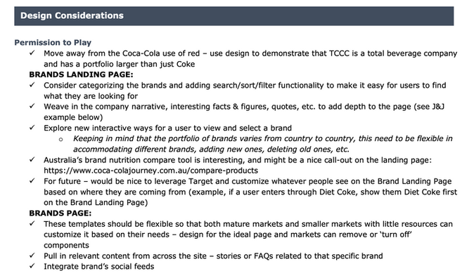
I documented the main experience sections needed for a global brand website by doing an industry audit and cross compared it to the needs of Coca-Cola. These included a home page, about the company, history, brand portfolio, social responsibility, corporate news and press center, careers, investors, and search. For each section I created an experience brief with design considerations, audience considerations and overall objective.
Sample of the Brands section brief
COMPONENT LIBRARY
One of the technical platform goals was to create and maintain a lean component library. I was tasked with only designing a core set of components that should be reused again and again. But the components could have different CSS or style attributes based on template and market needs - which provided the needed flexibility.
I ended up with 21 core components and worked with our development team to spec out each one.

Component Spec Example: Product Carousel
This component pulls nutrition data from a model and displays it as shown below. Each data point is mapped to a specific field in the data set. The interaction is also detailed out. As the user cycles through each product by tapping the image or using the arrows, it switches to the next subsequent product image, name description, and nutrition table.
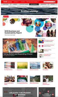
OLD DESIGN
To give you an idea of where the starting line was.
WIREFRAMES
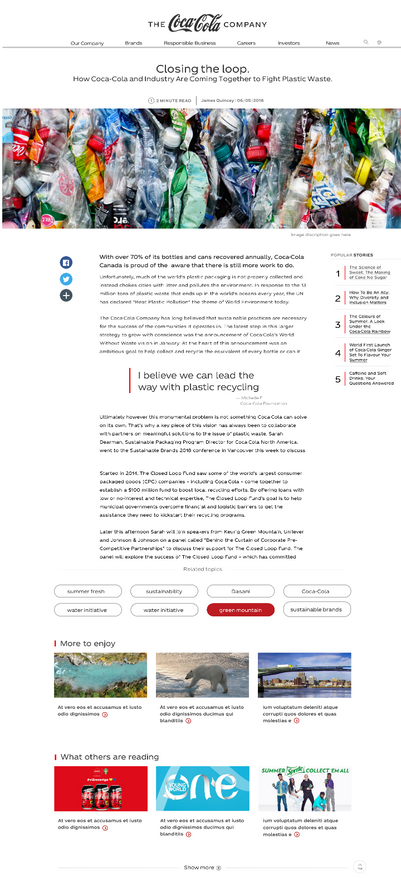
The wireframes were templates for each of the pages. I laid the foundation with the navigation, masthead, and footer. Then I brought in components that could be used to display the content needed for each page. One of the design goals is to focus on small pieces of snackable content so the user can easily skim and digest the material. The bottom half of the templates consisted of the data driven component, smart list, where we pull related content so the user can keep exploring.
KEY GOAL: Focus on a few lead stories and give the design space to breathe.
STYLE GUIDE
I worked with our art director to create a new, modern style guide.
OUTCOME
Finally, once we had all the pieces in place, I was able to pull it all together into a new design system and launch the platform.


