Ripl
Get seen on social in a snap.
SUMMARY
Ripl is a tool for small businesses to create and manage their social media marketing in one place. You can create branded posts, run targeted video ads, and track social performance.
As a senior designer at this startup, my role was to modernize the experience across the platform in iOS, Android, and Web app. A few key projects were the onboarding experience, new subscription design, introducing collections, integrating with Instagram business, and enabling Facebooks ads from the app.
PROBLEM
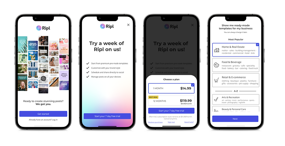
The mobile first-run experience was a key area for improvement. Using insights from reviews, user feedback and data from Amplitude, we learned where we were losing new customers and that we could do better to connect the dots from outside to inside the product. We were spending ~$20 a customer to only have them churn out after the trial. I worked with my product team to optimize this critical part of the journey to meet business goals while improving ease of use. The goal was to reduce the number steps, help users find a template, and boost trial attach.
SOLUTION
I simplified the onboarding process from the first touch points: ads & the app store. By working with the marketing team to ensure enough of the product features and benefits are shown in those steps I was able to minimize the experience after app download. I updated the design of the welcome step to a single screen and worked with the dev team to add SSO options for Apple, FB, Google for creating an account. I worked with the PM team to remove the screen asking the user to enter their business name as it wasnt required to get them into the experience. The pricing screen aka. upsell was one of the major drop off points as this is where we asked them to choose a plan and start the trial. By streamlining this screen with MVP features and updating the pricing stack to a drawer, I was able to reduce the number of drop offs at this step. Overall, I reduced the number of steps in the onboarding process from 9 to 4 to help users quickly jump into creating their content.

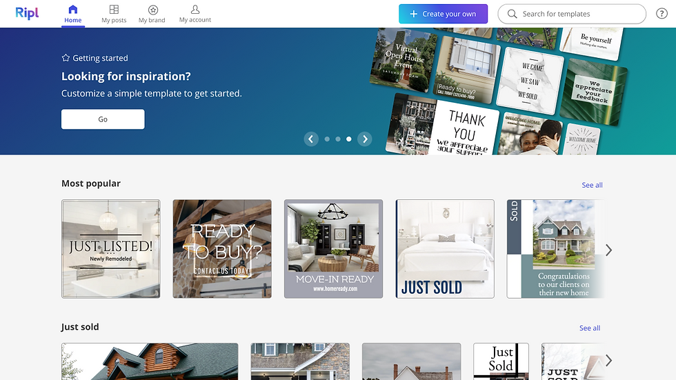
After a quick onboarding process, the user is introduced to the Home screen. I reimagined how this area is laid out and organized. By displaying personalized content at the top the user is quickly able to choose from a highlighted collection or scroll below to explore trending templates to customize. We knew from research that users knew what they wanted to make when they came in. they have intention and ideas but need guidance in choosing a template that aligns with what they have in mind. By grouping templates into collections, we are able to guide the user into selecting a template that will likely be successful and fit their needs for that post. The goal of the Home screen is to present the templates with a logical hierarchy and make it easier for the user to explore and scan.

I applied the same solution across platforms to the Web product as well. Building parity between mobile and web kept the experience uniform no matter which platform the user was creating on.


OUTCOME
The change in design led to higher trial attach by 11% from reducing the onboarding screens from 9 to 4. Less redundancy at that beginning meant users were spending less time in non-productive steps.The pricing screen grew conversion by 5% in the first month of launching.
I was looking to solve a major pain point for our users, which was "As a small business owner I am looking for ways to produce high quality content that is fast, easy, and replicable. I don’t have time to spend 2 hours producing content for social media everyday". The more quickly users are able to get into choosing a template and customizing a post, the more likely they are to return to either finish or to come back to create another one.
We saw that net out with the launch of the home screen and collections. In the first time using the app 30% more users selected a template, customized and completed a design. This was immensely successful in drawing a much more defined path for them to get inspired by a template and customize it with their brand.
